


< 헬베티카가 활용된 브랜드>
과거에서 부터 현재에 이르기까지 Helvetica의 힘은 디자인에서 타이포가 차지하는 것만큼 중요하다고 할 수 있을 정도입니다. 물론 이 활자체를 좋아하는 사람도 있고, 싫어하는 사람도 있겠지만, Helvetica는 아마도 문자를 이용하기 시작한 이래로 가장 많이 이들이 보아온 활자체가 아닌가라는 생각이 듭니다. 아래 브랜드들의 폰트페이스가 모두 Helvetica를 활용하여 제작되었으니, 아마도 세계에서 가장 유명한 활자체라고 해도 될 듯 하네요.

< 헬베티카가 활용된 브랜드>
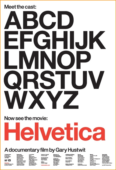
헬베티카 (2007) 영화포스터 / 다큐멘터리 / 80분 / 영국
Helvetica was developed in 1957 by Max Miedinger with Eduard Hoffmann at the Haas'sche Schriftgiesserei (Haas type foundry) of Münchenstein, Switzerland. Haas set out to design a new sans-serif typeface that could compete with the successful Akzidenz-Grotesk in the Swiss market. Originally called Neue Haas Grotesk, its design was based on Schelter-Grotesk and Haas’ Normal Grotesk. The aim of the new design was to create a neutral typeface that had great clarity, no intrinsic meaning in its form, and could be used on a wide variety of signage.[1]
When Linotype adopted Neue Haas Grotesk (which was never planned to be a full range of mechanical and hot-metal typefaces) its design was reworked. After the success of Univers, Arthur Ritzel of Stempel redesigned Neue Haas Grotesk into a larger family.[2]
In 1960, the typeface's name was changed by Haas' German parent company Stempel to Helvetica (derived from Confoederatio Helvetica, the Latin name for Switzerland) in order to make it more marketable internationally. It was initially suggested that the type be called 'Helvetia' which is the original Latin name for Switzerland. This was ignored by Eduard Hoffmann as he decided it wouldn't be appropriate to name a type after a country. He then decided on 'Helvetica' as this meant 'Swiss' as opposed to 'Switzerland'.